Monday, April 20, 2009

NIKE VS. FORTUNE


CLIENT: NIKE
AGENCY: DESIGNED04
DESCRIPTION: VECTOR ILLUSTRATION / PHOTOSHOP
YEAR: 2008

I worked on a campaign for Nike, based on the introduction of the Air Max current to the South African market. The brief was to depict the merging of two of Nikes most famous running shoes. The Air Max 90 and the Current. Heavy in construction the Air Max 90 was the first shoe to feature a visible air cushioning system and the Current which was construct using super light skin skin like material. Both of these were innovations in the running shoe market. The spread made up a six page fold out cover and were accompanied by editorial about the shoes designer Tinker Hatfield.
Just do it...

FAME AND FORTUNE


CLIENT:
FORTUNE FOUNDATION

DESCRIPTION: VECTOR ILLUSTRATION
YEAR: 2009

I drew this quickly the other day. It turns out that Fame and Fortune go together pretty well.

FUZIGISH VS. FORTUNE


CLIENT: FUZIGISH
AGENCY: FORTUNE FOUNDATION
DESCRIPTION: VECTOR ILLUSTRATION / PHOTOSHOP
YEAR: 2007

Fuzi are an institution. They have been skanking better and harder than any other South African band for as long as I can remember. I remember them causing around the block ques at The Jam back in the day. They have played with the likes of NOFX and Frenzal Rhomb and as far a South African punk and ska go, they are the masters. I was asked by Rockwell to do the artwork for their latest offering 'Roll with Punches', and it was a no brainer.

RATIONALE:

When I first heard the title of the album, my mind instantly conjured up fight scenes from 'Snatch' and reminders of playing Fight Night on playstation. Larger then life characters involved in a crazy underground world of high stakes illegal boxing. I got to work developing some sort of crazy fictional background story. Defining the characters according to their stage presence. Rockwell instantly become the champs promoter and trainer. With an afflection for booze, hotrods and women. If you were looking for Rockwell he was always in the Champs corner. Not afraid to bend the rules Rockwell was notorious. Ampie Omo formed part of the entrance entourage, with crazy gypsy like tricks and illustions. Ampie provided the showmanship for this crew of boxing misfits. Lee Lips aka Lucky Lee was the backing, big money and high stakes were the name of the game, and Lucky Lee was the master of 'moving funds around'. Not scared to back a sure thing, Lee put his money where his mouth was and let it ride. Big Willie was the enigma. Filled with the power of the darkside, Will's voodoo like dealings with opponents was priceless. Last but not least we have Jay Bones, the champ, the individual the show revolved around. Soft spoken as he may be, it didnt matter, Jay talked business with his fists and left the showmanship up to the rest of the crew. Delivering knock out after knock out, Jay bought the bite where the rest bought the bark. Saying that though, Fuzigish as a whole are not to be taken lightly, delivering fat ska beatings for many years past, and likely for many years to come...


Monday, April 13, 2009

CIRCUS NINJA VS FORTUNE: AND THE DEATH OF THE BIN


CLIENT: CIRCUS NINJA / THE BIN
DESCRIPTION: VECTOR ILLUSTRATION
YEAR: 2006

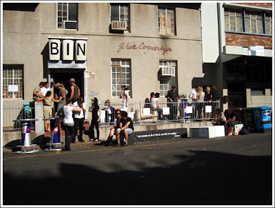
The Bin in Cape Town was a truly magical place. Blaise was the proud owner of one of the freshest independent shops the Cape Town streets have ever seen. Not to forget the hard work of Pierre and Cecil. The Bin was an institution.

Above is a limited edition I did with Blaise's clothing line Circus Ninja. It was eventuall printed on a burgundy coloured fitted T.

The Bin closed is no longer, and I think Paul White from Headline Payoff summed it up best in his piece Requiem for a bin:

I'm doing my internship just around the corner from where The Bin used to be and I walk past it every now and then. Actually, I have always tried to not walk right past it, rather to walk on the other side of the road or take a detour because it's been too devastating to be too close. I walked past it today and I felt such intense sadness. Outside, the painted bins still stood, not even in order. What the fuck is "IB"? I asked myself and where's the "N"? Yes, the building has been given a new coat of paint and it's now the home office for "Filcon projects" whatever that is (good luck to them in whatever it is that they do), but it just looks so empty and unlived in.

I think what makes me so sad in my soul is that The Bin was such an intensely creative space and now it's gone. I remember chip rolls from Cape Malay Takeaways with Rudi and Blaise, lazy Sunday afternoons drinking beer out of paper bags, real people and a real attempt to do something differently. Christ, this feels like the end scene of Titanic, when Rose walks down the staircase and there standing in front of her is everyone who was on the ship.

There is Kronk, crazy-talented nutball that he is, lying on the floor with his head in a box, screaming about something or other.

Just to his left is the hugest fucking block of polystyrene I've ever seen in my life, complete with ninja stars to throw into it.

In front of a writhing Kronk and a huge polystyrene megalith, Pierre aka The RCM is sitting at his computer, designing his little heart out, protected by his fedora and blazer.

I reach my hand down to touch the couch beneath me, it's one of those kind of brushed, silky feeling couches – with one of the strangest colour schemes I've ever seen in my life. The other couch has been painted and redecorated in typical Bin style, Warren Lewis typography deluxe.

Brian and Filipa from Fly On The Wall are also here, Brian laughing manically as we discuss which jungle animal we would most like to be and complain about not being able to tie bumble-bees to strings.

In steps Blaise, long-haired, moustachioed impresario of this entire circus. Wearing a worn out vest and some shorts and looking like some permanently smiling Satanic ringmaster, he and Rudi (wearing his trademark white Converse Allstar lows and skinny jeanpants) light cigarettes together and smoke inside. Inside! No fucking PC bullshit here – this is The Motherfuckin' Bin! Put your cigarettes out on the fucking floor if you want to.

Downstairs, Justin is lovesticking all over the place – painting on the walls and manning the till when he feels the need, thick-rimmed glasses flashing acknowledgement as we cross eye-paths.

Liam Lynch, everyone's favourite photographer (say otherwise and you'll have a skinny-jeaned horde ready to tear your eyes out, spit on them and stand on your ultra-clean shoes) arrives. Hair flaming in the sunlight, arms all squidded out, mind razor sharp, he slides in and the conversation takes an altogether more serious and possibly metaphysical turn. Taking pictures here and there as he feels the need, as if it's the most natural thing in the world (which to him, it is) more cigarettes are lit as the conversation rolls on.

Where are Jack and Rose when you need them?

What a team of people. What a ragtag cigarette-smoke-sodden collection of South Africa's creative future. I am honoured that I was able to interact with the people, the space and the time that was The Bin. No one was perfect, but that was cool. Everyone was talented. Perhaps for me, the best way to sum it up is, "it was the kind of place where people only wore their sunglasses when it was sunny."

And you know what made The Bin such a great experience? The fact that I haven't once mentioned the fact that it was a shop. The Bin was a meeting place for like-minded people, where whatever was cool was what you decided it to be.

To all of you who were involved in The Bin, thank you. Thank you for creating a place where Hp really felt at home.

Godspeed you black rubbish receptacle,
Paul (Hp)

Excellent...
ABATWA VS FORTUNE


CLIENT: FORTUNE FOUNDATION
DESCRIPTION: VECTOR ILLUSTRATION / PHOTOSHOP
YEAR: 2006

An illustration based campaign to promote a childrens book for adults that I have been thinking about and working on for years. The story so far is a short one unfortunately. The Abatwa are a mythical character taken from Zulu myths and legends. The idea was too create a set of characters that could exist in modern day times only the morals of their stories would be similar to those in old Zulu fables. In attempt to keep these stories alive for generations to come, remind some of us older folks about them, and hopefully take the story to an entirely new audience. The original idea featured city wide treasure hunts and could have been incorporated into a really neat marketing excersive for high end brands. Adidas and Nike I am looking at you. Come on you know you want too...

Still very much under construction.

Many of the Abatwa's were available at the last R100 show and at Computer Club at Whatiftheworld.

Should you be interested in finding me about the Abatwa and the proposed campaign drop me a mail.

THE STORY SO FAR:


In Zulu mythology, Abatwa are tiny humans, supposedly the tiniest living things in human form. A Zulu spirit species, they are clan-like creatures said to be so small they can hide under a blade of grass and are able to ride ants.

They live nomadic lifestyles and are continually on the hunt for ‘game’. If one happens to come across an inner city Abatwa, the Abatwa will typically ask a question like: “from where did you first see me?” , to which you must reply by saying you have met them somewhere before, or at some far away place. If someone answers by saying they saw them here for the first time, the inner city Abatwa will try to kill them with poisonous pills. They are extremely sensitive about their size, stepping on an inner city Abatwa is also a death sentence. As a result of their shy nature, they will only tolerate being seen by the very young at heart.

Totally Bizarre...


MINI VS GOLDFISH VS FORTUNE


CLIENT: MINI COOPER/GOLDFISH
AGENCY: BLACK RIVER FC
DESCRIPTION: VECTOR ILLUSTRATION
YEAR: 2009

Early this year I was commissioned by Black River FC to create artwork for the band Goldfish. The brief was that the band was becoming Mini Cooper ambassadors and each of the two members were going to drive branded Mini Coopers. The idea was to create a yin yang style illustration that could be applied to the one black Mini and the one white Mini. When the cars were parked next to each other the yin yang would be visible. The original idea was very oriental in styling and I decided to take a slightly different apporach. This illustration is just in scamp format as I did not complete the final job.

RATIONALE:

The illustration is based on the Yin Yang symbol and incorporates the two members as two goldfish. The style is less oriental and more sunrise at a beach party. The colour treatment is based on the rising sun and the clear blue waters of island destinations. This is echoed by the cars colours as if one is night and one is day. The circular flow of the water around the fish represents the records that Goldfish spin. The movement in the orange and blue semi-circles adds to this motion.

CHILDLINE VS 5FM VS FORTUNE: 2009 CALENDER


CLIENT: 5FM/CHILDLINE
AGENCY: NETWORK#BBDO
DESCRIPTION: VECTOR ILLUSTRATION / PHOTOSHOP
YEAR: 2009

Every year Childline and 5fm produce a calender to raise money for Childline. I was choosen to submit artwork for one of the months. The concept was basically each artist was assigned a month and a small quote from a child based on a topic. Below is the one I received from young Melissa:
Name: Melissa

Age: 13

What do you want to be when you grow up? 'I want to be a president because its like a man who are becoming president. I think it will be a change, as woman can also be presidents.'


FOKOFPOLISIEKAR VS FORTUNE: 2009 KKNK T-SHIRT


CLIENT: FOKOFPOLISIEKAR
DESCRIPTION: VECTOR ILLUSTRATION
YEAR: 2009

I have been the sole creative partner of Fokofpolisiekar since day one. I have worked with them on numerous projects in the past and produced some of my favorite work to date. All the guys in the band are very close friends of mine and the impact they have made on the South African music scene and Afrikaans culture as a whole in astounding. Being able to be a part of some thing that big is a true privilege.

This is the latest artwork I have produced for them. Not in the vein of what we usually do, but with 5 colours to work with I simply had to go techni-colour for all the new-age-indy-kids.

The shirts were available during this years KKNK if I am not mistaken.


[R]EVOLUTION VS FORTUNE FOUNDATION: LOVE YOUR CITY


CLIENT: [R]EVOLUTION
DESCRIPTION: VECTOR ILLUSTRATION
YEAR: 2008

If I had to point a definite finger at where in my life the source of my creative river sprung from it would have to be skateboarding. My one and only passion growing up, it taught me to see the world from a completely new perspective. It taught me to destruct my surroundings and construct my own ideas of what was possible. I was never the best, but it was not really about that. If someone landed the easiest trick after trying all day or some one stuck the most technical trick first time the shouts of 'Yeah!' from your buddies were always at the same volume and intensity. A true form of expressionism with an absolutely level playing field, the reason for this was simple; It was never about anyone else.

Skateboarding led me down some interesting paths and to some far off destinations. But the journey that it took me through a little low-brow side of the creative world is the one that I am truly grateful for. It encompassed music, art, graffiti, customization, silk screening, vinyl toys, limited edition items, artist series, punk rock, OG Hip-hop, graphic design, sneaker pimpin', videography and more. I am a little too old and lazy to skate these days, but I watch Andrew Reynolds part in The End on VHS and think about how those 4 wheels made me who I am today...

It was an honour to have my artwork featured on three decks for [R]evolution.

100 of each deck was printed and sold.

Below is the concept pitch I submitted.

CONCEPT:


Skating to me was never about malls or super skate parks. Skating was looking forward to going into the city on weekends. Cruising among the sites and smells of Durban. Pushing through traffic, avoiding pedestrians and popping off curb cuts. Stopping to buy 99c soft serves at the workshop after a session at Town Hall. Hitting the beachfront mid-curb on a Sunday and eating pineapple dipped in curry powder. Getting offered readymades by the car guard as we all piled into someone’s mom’s borrowed hatchback, on our way to the Harbour, the Waterworks, The Island Style mini by the wheel. I want my decks to be all about these adventures. I know it was the same thing when I moved to Cape Town, just mates missioning through the somewhat subdued city. I want to convey the sights and sounds of the city that as a skateboarder, provided me with endless possibilities. The city I love.

METHOD:

I did this by creating three decks, one for each of the major cities. Cape Town, Durban and Joburg. Each one features a background with numerous icons that make the particular cities different from one another. Whether it’s types of food (Bunnies for Durban, fish and chips for Cape Town etc.), Road Names (Florida Road, Long Street etc) or even iconic places (Taco Zulu, Royale, Tokyo Star etc). By showing the contrast between the cities it creates a feeling of unity in the buyer. I am from Durban, so naturally I would be inclined to buy the board with things that I can relate to and in-turn would be representing for my city.

Below are images from the BigWood II exhibition where the decks were featured. Courtesy of [R]evolution.

LEVIS VS FORTUNE 2008


CLIENT: LEVI'S SOUTH AFRICA
DESCRIPTION: VECTOR ILLUSTRATION
YEAR: 2008

Last Year I was asked by Levis South Africa to be the first artist involved in the 1 of 100 featured artist program. Basically the the concept was to design 6 shirts that were to printed in a limited edition of 100. The shirts were distributed among the 10 top Levi's stores in the country.

Each Shirt was individually numbered and packaged in a a blind box format. So you didn't know exactly what edition of the series you would get.

I went for a very bright green colour scheme and featured a more street style aesthetic. All illustrations are true vectors.

A highlight of this project was having a special made point of sale unit which feature artwork by The Fortune Foundation and displayed all the t-shirts. Along with the t-shirts was a take-away artist card. The artist card featured the copies of the artwork and a short bio.

As far as I know all of these shirts sold out. So if managed to get your hands on one take a photo and send it too me. Please also include what number of 100 you have and what shop you bought it from. The best 5 photos will receive a special Fortune Foundation goodie bag.